if recent intertube rumorz are to be believed, the rate of the dollar's inflation and decline of american purchasing power is far greater than official statistics proclaim. then again, if you have to buy your own gas, food, and other essentials, you know this already.
upon the release of march's consumer data, various news organizations started to get a little curious about the way our government measures inflation. from reuters:
Overall, the consumer price index rose by a smaller-than-expected 0.2 percent in April. So-called core prices, which strip out food and energy costs [italics added for emphasis], were up just 0.1 percent, half the increase that analysts had forecast.
so to soften the data up to make it look pretty on paper (in the data business we call it "massaging"), the consumer price index doesn't accurately measure THE SHIT THAT'S GETTING REALLY EXPENSIVE REALLY QUICKLY? the houston chronicle says, quite simply: "It makes you wonder if the government is performing a statistical sleight of hand."
and people wonder why nobody trusts anything the government says. this article from michael pento of the huffington post breaks it down a little further, going into concepts such as gdp as it affects the cpi and other things that my two semesters of slept-through college economics classes haven't prepared me to fully comprehend or comment upon. however, i do understand this: "...the report claimed that consumer's energy costs were unchanged while the actual price of crude oil rose about 12.5% and gas prices rose 11% during the same period in question..."
yeah. so all these numbers are a little fudged?
ok, they're apparently a lot fudged.
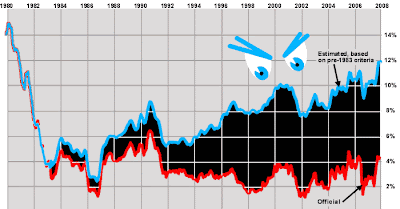
harper's recently published a short history of how inflation data has been increasingly fudged since the nixon administration, with disastrous effects on our national perceptions of what's actually happening in the economy. the article requires a subscription, but a good chunk of it can be obtained here. here's a little graphic they use to explain the problem:
the red line is inflation as it is measured by contemporary standards. the blue line is inflation according to pre-1983 standards. the black morass in the middle is apparently the gaping mouth of a monster that is coming to eat us.
i want my mommy.
UPDATE: marketwatch has now joined the chicken little party. i'm in good company.
Tuesday, May 20, 2008
the great inflation swindle
Subscribe to:
Post Comments (Atom)
1 responses:
There was an article in The New York Times about this recently: http://news.yahoo.com/s/ap/20080520/ap_on_bi_go_ec_fi/economy;_ylt=AvNtzuXJNF17wNiSF12U5orv5rEF
Their point is that certain things, like food and gas and building materials, are getting much more expensive, while other things, such as consumer electronics, are getting cheaper.
This is retarded. From the article: When you dig into the Consumer Price Index, you start to realize just how many things fall into this category. The price of major appliances has been flat over the last year. Furniture is 1 percent less expensive. A decade ago, a basic four-door Toyota Corolla LE cost $16,018, according to the company. The 2009 basic model costs $16,650, and it’s a safer, more powerful, more fuel-efficient car than its predecessor.
First of all, most people don't purchase a Toyota Corolla every year, so any price decrease isn't going to save them money to put toward the food and gas they can't afford.
Secondly, the guy is making a point that inflation isn't so bad by singling out a price that went up four percent. The idiocy speaks for itself.
Post a Comment